
Project Overview
The Telus Android page was a net-new design project aimed at consolidating previously separated Samsung and Google pages into a single, cohesive Android brand experience. Before this redesign, Telus housed Android brands on separate pages, leading to a fragmented user journey where brands competed against each other for attention. The new page was developed to unify these brands under one Android umbrella, streamlining the research and learn (R&L) experience while also improving sales opportunities. The Telus Android page is now live and can be viewed here.
The primary goal was to provide a platform that could showcase all Android brands (Samsung, Google, Motorola, etc.) while driving customer engagement into Telus’ e-commerce flow. By creating this dedicated Android space, Telus aimed to boost sales across all channels, enhance Android marketing initiatives, and improve the overall user experience. This page also served as a high-priority project for the Android marketing team, with the potential to unlock more funding for future initiatives by successfully delivering on this task.
The problem
Prior to this project, Telus’ Android offerings were scattered across separate Samsung and Google pages. This separation led to several issues:
A disjointed customer experience: Users researching Android devices had to navigate between different pages for Samsung, Google, and other brands, creating friction and confusion.
Brand competition: With separate pages, Samsung and Google were essentially competing for user attention, diluting the overall Android brand experience.
Unclear navigation: The Google page was less visible due to its lack of placement in Telus’ navigation bar, contributing to its higher bounce rate compared to the Samsung page. The Samsung page did not have this issue due to its prominence in the mobility sub-navigation as a result of Samsung funding.
With these challenges in mind, the new Android page was designed to:
Create a single, cohesive space for all Android brands.
Align with Telus' business goals of increasing sales across all channels.
Drive more customers into the sales flow and improve the R&L experience.
My role
As the sole product designer on this project, I was responsible for the entire UX process, including planning, strategy, wireframing, visual design and final design. I collaborated closely with the content team, product owner and marketing and Android stakeholders to ensure a smooth workflow and alignment with both business and user needs.
Design process
We followed a design thinking methodology, focusing on research and strategy before diving into design. Although we didn’t conduct user testing prior to launch due to time constraints, we made data-driven decisions based on analytics from the previous Samsung and Google pages.
Research Insights:
Samsung page: The Samsung page saw 93.4% of visits from mobile devices, with 92.1% of all visitors being new customers. This highlighted the importance of optimizing the new Android page for mobile.
Google page: The Google page had a significantly higher bounce rate due to unclear navigation and its absence from Telus’ mega navigation bar. In contrast, the Samsung page had a more prominent spot, contributing to its higher traffic.
Paid media: 84.6% of all Samsung page visits came through paid media, with SEO-driven traffic accounting for 60.3%.
From these insights, we determined that the new Android page needed to:
Focus on a mobile-first design.
Ensure clear, easy-to-navigate paths for users.
Highlight Android’s top brands and drive traffic into Telus' sales flow.


Wireframing & Prototyping
Wireframing
In the early stages of design, we created low-fidelity wireframes to explore layout options. These wireframes focused on simplifying the user journey, ensuring that visitors could easily explore multiple Android brands without feeling overwhelmed.
Collaborative Sessions: I led several jam sessions with the content team to fine-tune the wireframes. We leveraged successful design patterns from the Samsung page, using SEO-optimized copy and mobile-friendly layouts to enhance user engagement.
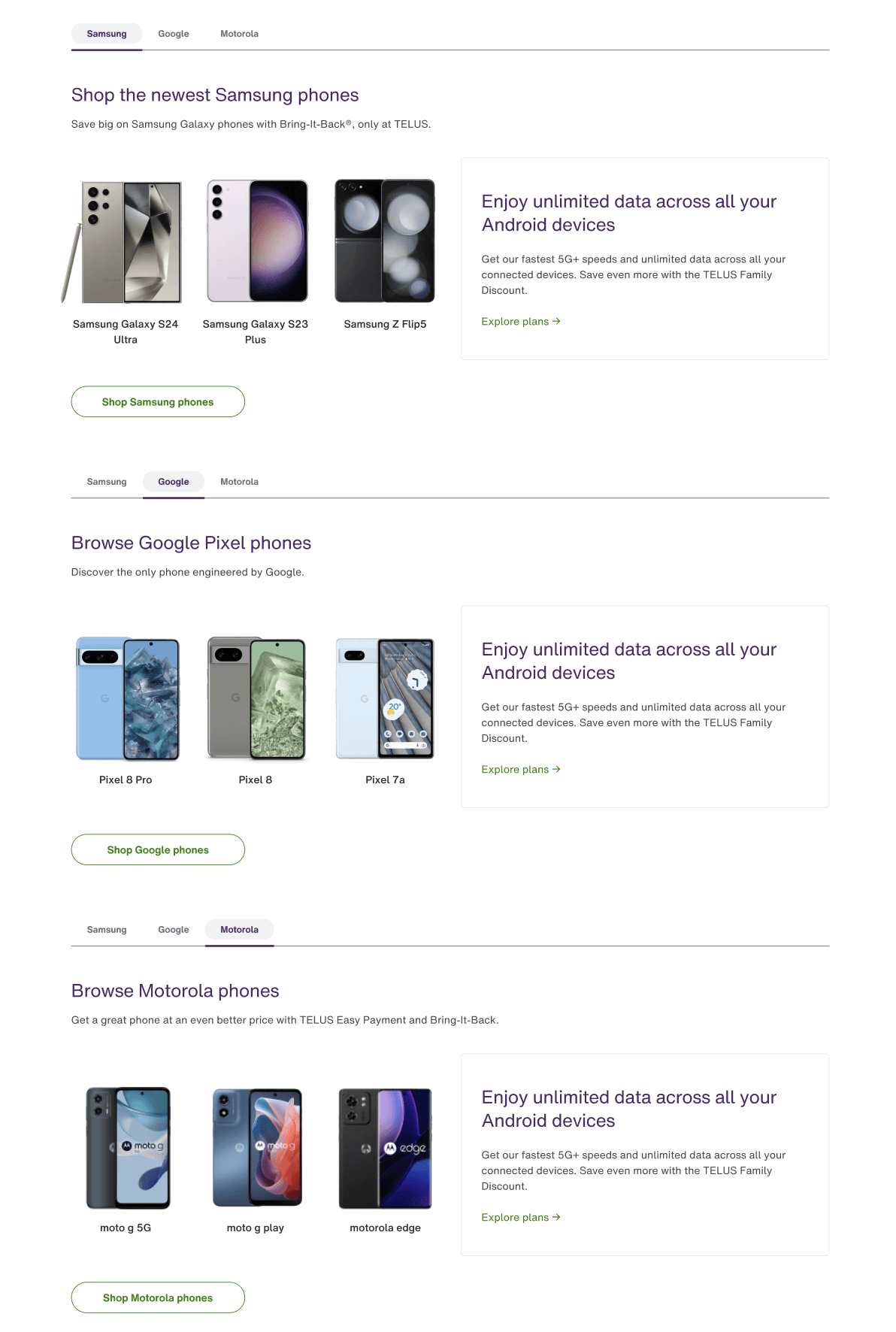
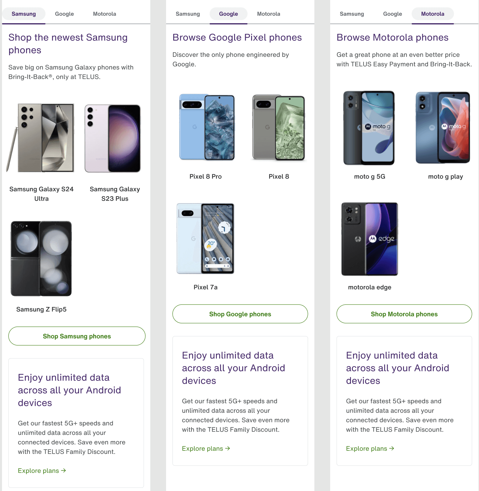
Key decisions: The wireframes included a hero carousel to feature multiple Android brands and campaigns, a device catalogue with tabs for different brands, and cross-sell opportunities for Android accessories, tablets, and more.
Prototyping
We then moved to prototyping, creating clickable prototypes using Figma. These prototypes simulated the full user journey, from landing on the Android page to navigating the device catalogue and exploring the sales flow.
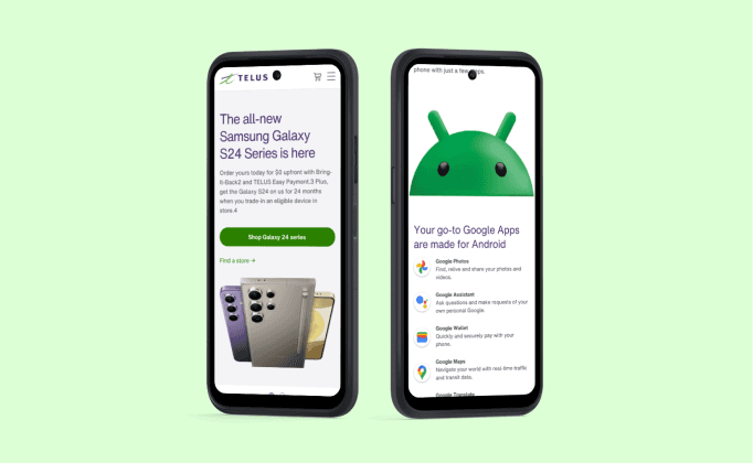
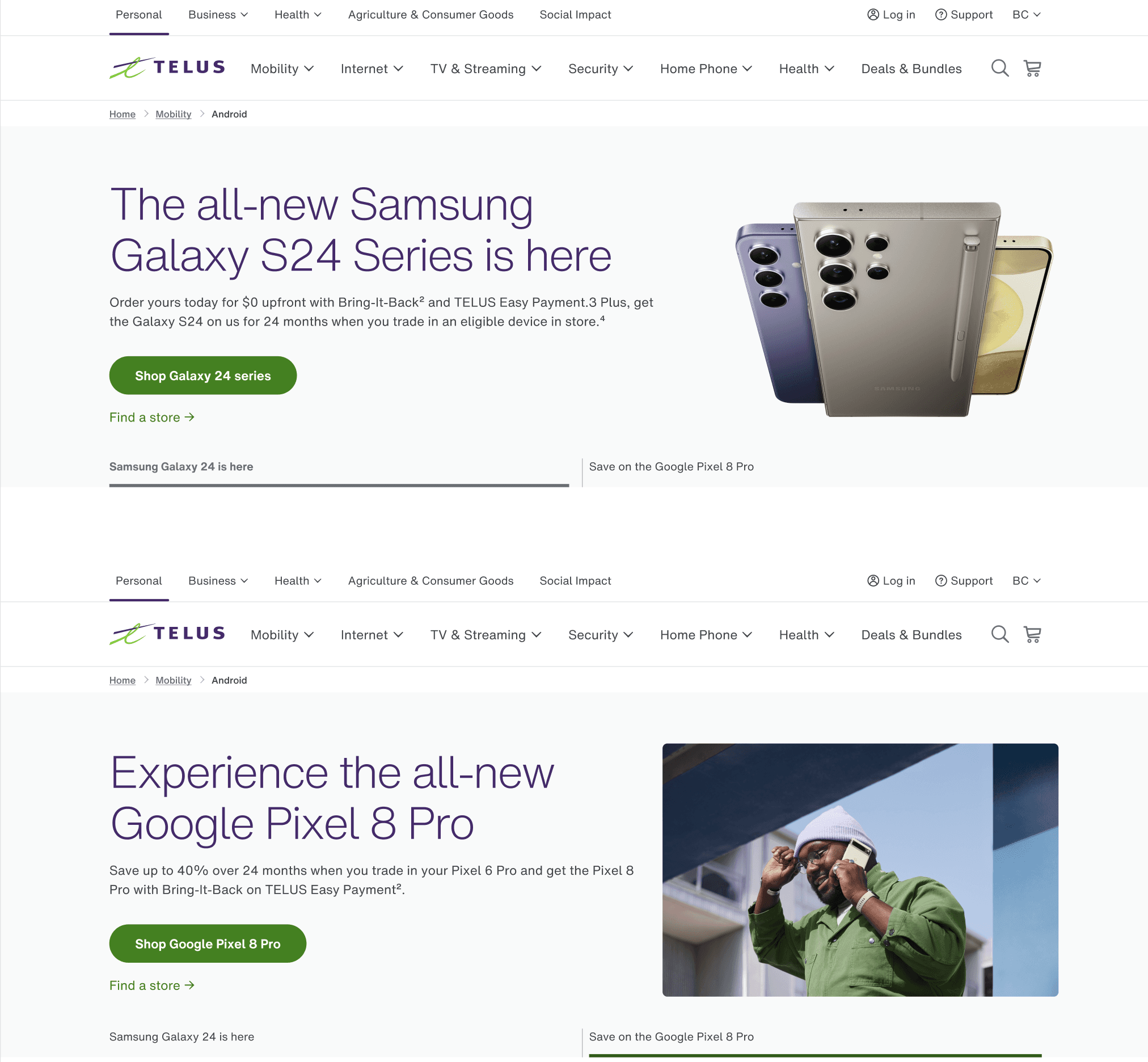
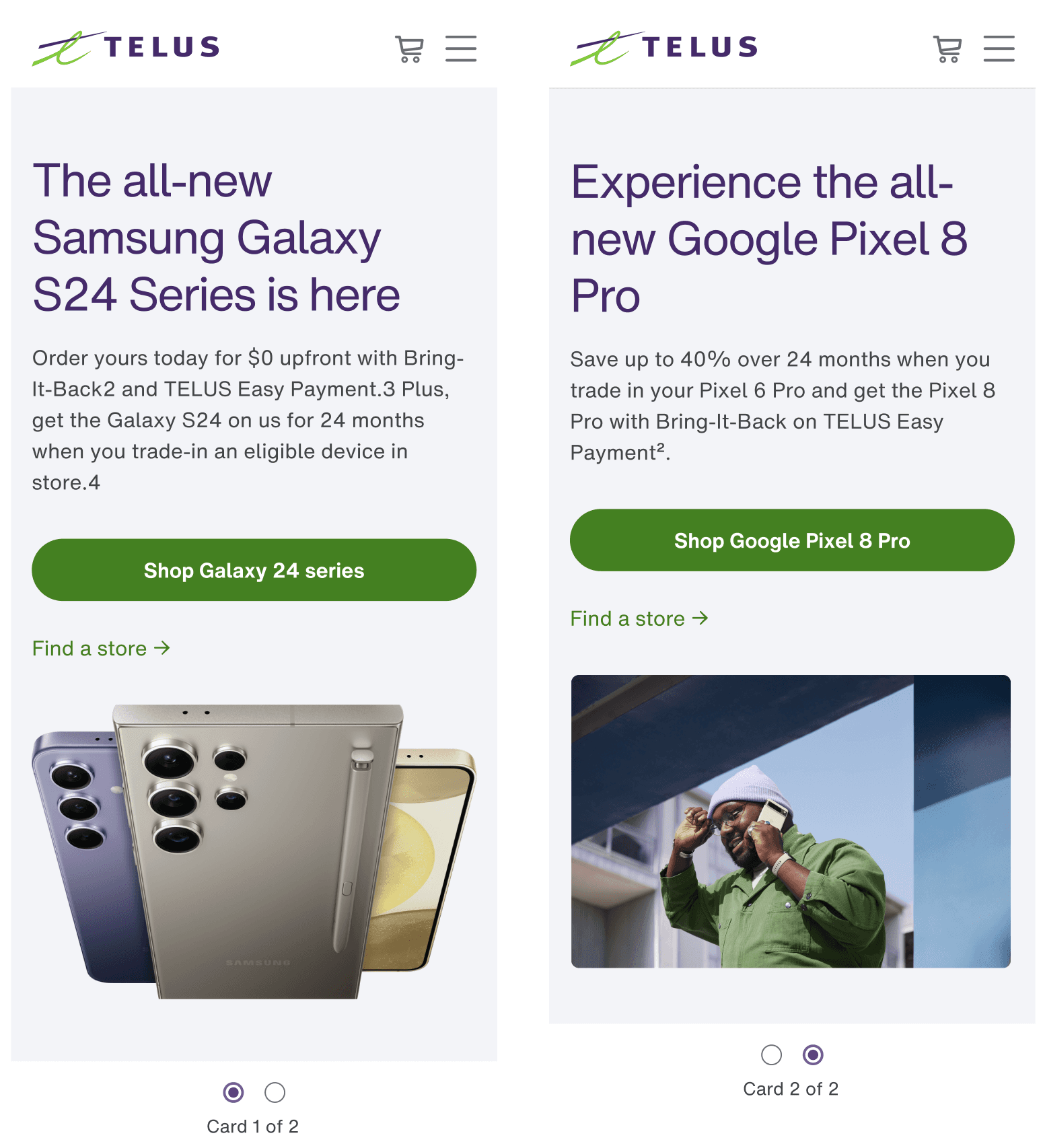
Feedback loops: The prototypes were reviewed by key stakeholders, including the Android marketing team. Their feedback led to adjustments, such as limiting the hero carousel to two slides (based on data showing that users rarely engage beyond the second slide).
Mobile-first approach: Given the 93.4% mobile traffic on the Samsung page, our prototypes prioritized mobile usability, with touch-friendly interactions and clear calls to action.
Key decisions made during wireframing and prototyping:
Hero carousel structure: Based on feedback from the marketing team and analytics data, the carousel was limited to two slides to ensure maximum engagement with the most important content.
Device catalogue layout: The layout was refined to offer users a seamless experience across different Android brands, balancing brand visibility with user engagement.
Mobile-first focus: Given that 93.4% of visits to the old Samsung page were from mobile users, wireframes and prototypes were designed with mobile in mind, ensuring that interactions were optimized for small screens.
Wireframing and prototyping not only guided the visual design but also shaped the strategic content placement and overall flow, aligning both user needs and business goals.
Challenges & Constraints
Challenges
Technical limitations: The existing Telus design system had some constraints, which made it difficult to implement more modern design elements like horizontal scroll cards.
Brand representation: Balancing the visibility of Samsung, Google, and other Android brands while ensuring a cohesive experience was challenging, particularly since some brands provided funding for this page.
Tight timelines: We had a six-week timeline to complete the project, from February 2024 to April 2024.
Overcoming the challenges
We used existing components in creative ways to overcome technical limitations. For instance, we adapted the familiar carousel component to fit our goals, limiting it to two slides based on analytics data showing that spots beyond the second rarely received interaction.
We maintained close collaboration with the Android team, limiting feedback cycles to avoid delays, and iterated on designs based on their input.
To ensure balanced brand representation, we carefully structured the device catalogue and ensured that the Android OS and Google apps were prominently featured in banners.
Key Design Solutions
The final design achieved the following key objectives:
Hero Carousel: The carousel at the top of the page provided two prominent spots for showcasing Android campaigns and could easily be updated by marketing teams to align with ongoing campaigns.
Device Catalogue: Tabs above the device catalogue allowed users to quickly switch between popular Android brands, with devices prominently displayed.
Cross-sell Opportunities: By including cards for Android tablets, accessories, and Google apps, we expanded the page’s reach beyond mobility, enhancing cross-sell opportunities.
The design aimed to drive users into the sales flow, with clear calls to action directing them to view mobility plans and purchase devices, all while maintaining a mobile-first focus.

Results & Impact
We are currently awaiting analytics data to fully assess the success of the new Android page. Once available, we plan to track key metrics such as:
Bounce rate: To see if the simplified navigation and cohesive brand experience have reduced bounce rates, particularly for the Google section.
Sales conversions: To determine how effective the page is at driving users into the Telus e-commerce flow.
User engagement: Comparing time on page, click-through rates, and other engagement metrics.
Reflection
If I had more time, I would have preferred to run an unmoderated user testing session to gather feedback from real users before launch. This would have helped validate our design decisions and potentially revealed areas for improvement.
This project reinforced the importance of collaboration and data-driven design. Working closely with content and marketing teams helped ensure that the design aligned with business goals, while analytics from previous pages provided valuable insights that shaped the user experience.

