Telus
Android Landing Page
Industry
Telecom
Year
2024
company
Telus
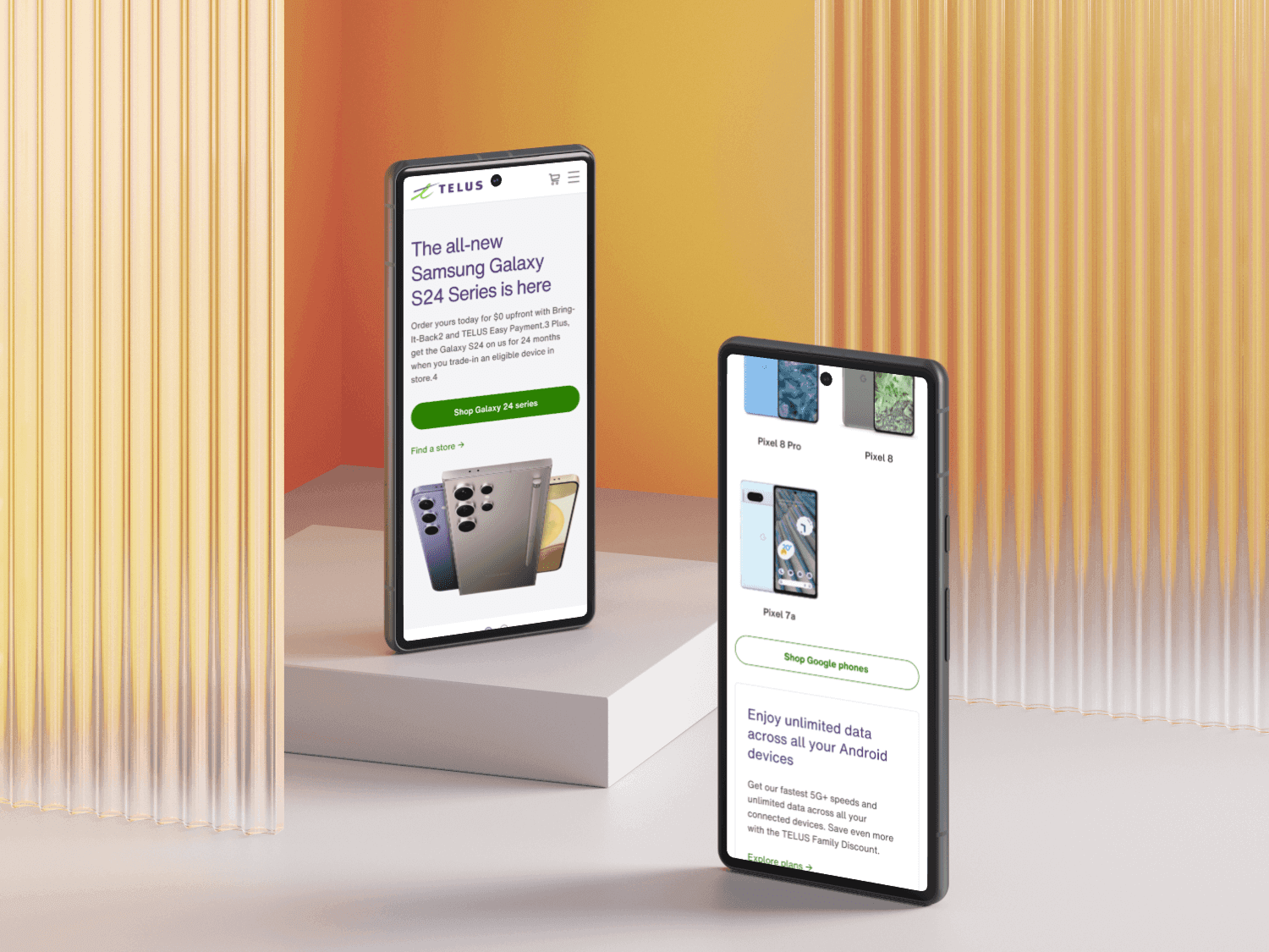
The TELUS Android page was a net-new web experience created to unify Android brand content across Samsung, Google, Motorola, and more. Previously, TELUS maintained separate pages for Samsung and Google, which created a fragmented and competitive experience that confused users and weakened Android's collective value. This new Android hub simplifies the research and learn (R&L) journey, enhances brand cohesion, and helps drive users into TELUS' sales flow. The page is now live and serves as a foundation for future Android campaigns and funding initiatives. The Telus Android page is now live and can be viewed here.
Role & Timeline
Role: Sole UX Designer
Team: Design, Content, Marketing
Timeline: Feb–Mar 2024
Platform: Web (desktop & mobile)
The Problem
The existing Android device experience at TELUS was fragmented across multiple brand-specific pages. This created several challenges:
Disjointed UX: Users researching Android devices had to switch between multiple pages, causing friction and confusion.
Brand competition: Separate pages pitted Samsung and Google against each other for attention.
Unequal visibility: The Google page lacked placement in TELUS' mega navigation, leading to a higher bounce rate than Samsung’s.
We needed to create a single, cohesive space that supported all Android brands, aligned with TELUS’ sales goals and improve the R&L journey.
Goals
Consolidate Android brands into a unified experience
Improve navigation clarity and mobile usability
Drive users into the device catalogue and e-commerce flow
Support Android marketing campaigns with a scalable design
Design Process
We followed a design thinking methodology, focusing on research and strategy before diving into design. Although we didn’t conduct user testing prior to launch due to time constraints, we made data-driven decisions based on analytics from the previous Samsung and Google pages.
Research Insights
We started by analyzing performance data and pain points from the legacy Samsung and Google pages to inform our strategy.
Key insights:
Mobile dominance: 93.4% of Samsung page traffic was mobile, guiding a mobile-first approach.
Visibility issues: The Google page’s absence from the mega nav led to higher bounce rates.
Paid traffic impact: 84.6% of Samsung traffic came from paid media, reinforcing the need for high-converting landing elements.
Wireframing
Low-fidelity wireframes explored layout options that simplified navigation and made brand switching effortless.
Key design choices included:
A hero carousel to feature rotating brand campaigns
A device catalogue with tabs for Samsung, Google, Motorola, etc.
A cross-sell section highlighting Android-compatible products like accessories and tablets
To optimize content and structure, I facilitated collaborative jam sessions with the content team. We reused successful design patterns from the Samsung page and wrote SEO-optimized copy to support organic visibility.
Prototyping
Using Figma, we created interactive prototypes that simulated the entire journey—from the hero banner to device selection. Given the mobile-heavy traffic, we emphasized:
Touch-friendly interactions
Sticky headers and CTAs
Shorter carousel slides (limited to two based on engagement data)
Stakeholders from marketing provided feedback that helped us fine-tune layout and prioritize campaign real estate.
Results and Impacts
Early Indicators (Post-Launch):
While full analytics are still being gathered, we are tracking:
Bounce rate reductions — especially for users coming from paid media to the Google section
Sales conversions into the TELUS e-commerce flow
Time on page and brand tab engagement
This page also laid the foundation for Android-specific campaigns and is already being used by the marketing team for new promotions.
Reflection
This project underscored the value of cross-functional collaboration and fast, data-informed decision-making. Working closely with content and marketing ensured the design aligned with both user needs and business outcomes. If time had allowed, I would have conducted unmoderated user testing before launch to validate key assumptions, especially around navigation and device comparison. The Android page is now serving as a model for future campaign landing pages and has opened doors for further investment in TELUS' Android ecosystem.